The Cost of Government Health Care
Most health policy researchers probably believe government-run health care is less costly than private health care. For many, the model system has always been the UK’s National Health Service (NHS). Progressive Democrats like Presidential candidate Kamala Harris and socialists like Senator Bernie Sanders have been advocating that the US adopt a single-payer, taxpayer-supported health system like the NHS since the turn of the 20th century. “Medicare-for-All†is the latest incarnation for this goal.
But is this really true? Would implementing Medicare-for-All in the US actually reduce our health care costs?
On one hand, the UK clearly spends less GDP per capita on health care than the US, as do all other OECD countries. This comes at a cost in terms of access problems for specialty services and below average performance on many quality metrics (e.g., 5-year cancer survival rates). But Brits clearly spend less than Americans.
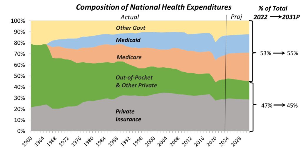
On the other hand, increased government funding has clearly not helped control health care spending in the US. The following chart shows that federal, state, and local governments now directly finance more than half of health care in the US:

Furthermore, OECD data show that the US government indirectly controls another 30-35% of health care, bringing its overall control of health care to about 85%, more than the UK and Canada.
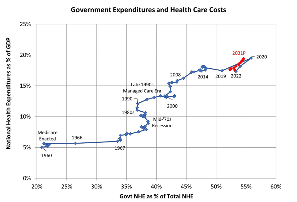
What has happened to US health care costs over that period of time? They have been on a long-term growth path:

Before Medicare was enacted in 1965, health care costs as % of GDP were similar to several other OECD countries. But once taxpayer-funded Medicare and Medicaid took hold, using the same providers and services as employer-funded private health insurers, our costs quickly outpaced all other OECD countries. Public health expenditures during COVID pushed NHE to 19.5% of GDP in 2020. While it has dropped back since then, CMS projects that it will be close to 20% again by the end of the decade.
In the US, at least, government funding looks more like a cost accelerator than a cost reducer.
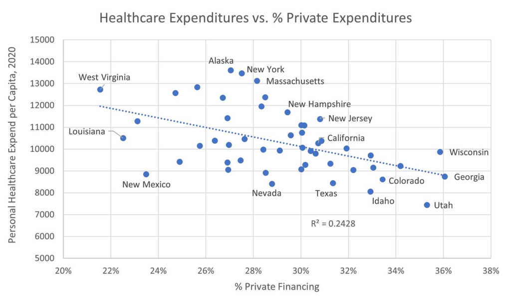
One more piece of evidence: Every five years, CMS reports private health insurance, Medicare, and Medicaid expenditures by state. The private health insurance statistics are estimates and don’t include out of pocket expenditures. Here is a chart showing the relationship between % private health care expenditures and personal health care expenditures per capita across states:

This chart shows that the greater the % private financing, the lower the per capita healthcare costs. And this finding doesn’t change when controlled for the average age of the population. At the state level, as well as the country as for a whole, the greater the taxpayer’s share of funding, the higher the cost of care.
Latest Blog Posts
-
CDC Guidance for Vaccinated People: What Are They Thinking?
Thank God (and Moderna) that I’ve finally gotten my two COVID-19 vaccinations and waited two weeks to become ‘fully vaccinated”! Now I can resume a normal life, free from fears that I will contract the disease or pass it along to others. Right? Well not really. The CDC today released its ‘Interim Public Health Recommendations…
-
Regulatory Purgatory
A recent article in Modern Healthcare shows how CMS regulations can tie providers into knots and add administrative costs. Every mail-order company and shipper in America, including USPS, UPS, and FedEx, all work with inexact address data. Apartment or suite numbers are left off, ‘Drive’ is abbreviated as ‘Dr’ or ‘Dr.’, names are misspelled, and…
-
The Trump Administration’s Response to COVID-19
With the recent resurgence in coronavirus cases, the Trump administration is being vilified by Democrats and the media (and some Republicans) for mishandling the COVID-19 pandemic. It’s too early to write a full and fair history of our nation’s response to the pandemic. But if you step back and review the administration’s actions, they responded…


Leave a Reply